


Guest Blog by Sarah Heron
When having a personal branding shoot, or indeed any form of personal photography, having a Colour Analysis with a trained Personal Colour Consultant beforehand is an absolute MUST!
Let me explain why…
- Wearing colours that suit you will make your skin clearer, diminish fine lines and dark circles.
- Your skin will radiate with a healthy glow, naturally and physiologically, so you’ll look younger and fresher, even without make up!
- You’ll find the colour of your eyes will ‘pop’ too, so wearing colours that suit you will immediately enhance your photographs.
- By wearing colours that you know naturally suit you, you’ll feel good too. Wearing colours that are harmonious with your natural colourings will give your confidence an inner boost, consciously or subconsciously, often creating an improvement in posture. An ideal asset for photographs being taken.
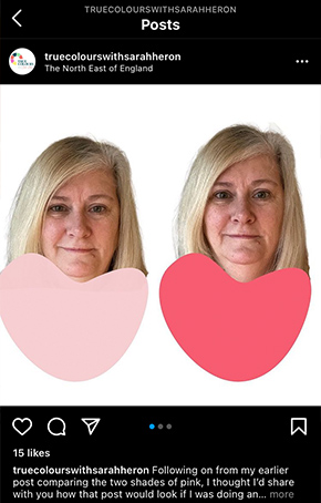
This image below shows an example of how different colour tones can effect the brightness and shadows on our skin. It makes a noticeable difference doesn’t it?
Beware of black
Black is a particularly difficult colour for most women to wear unless they have high levels of contrast – think Snow White with her jet black hair and very pale skin, but it is often a popular choice for formal headshots. While black is considered a good ‘professional’ colour, it can easily diminish you and you’ll simply disappear! Scientifically, blacks absorbs all the light that comes at it, so it tends to accentuate fine lines, blemishes and dark circles when worn close to the face and is very ageing, draining the face of colour.
Making colours work together
Following a Colour Analysis, you may begin to introduce new pieces into your wardrobe, in your ‘new’ colours. Over time you’ll find that the contents of your wardrobe begin to work with each other – and your lifestyle. If you need outfit changes for your headshot portraits then this provides an opportunity for co-ordinating items being utilised and props, if required, can be prepared to support and compliment your palette of colours. You could perhaps choose two of your best neutrals – navy, dark grey, chocolate brown for instance, depending on your diagnosed palette – and then simply add accent colours or different accessories to vary the shot, knowing the look will be completely congruent.
Choose colours carefully
Colour is very powerful in enhancing and flattering when we get it right but, get it wrong and the results can be less than complimentary, however fabulous the expertise and knowledge of the photographer. Colour often drains us of colour and ‘drowns’ us, so that we see the colour not the person. Wearing colours that do not align with our natural colouring tend to make us appear dull, flat, unbalanced and often older!
And who wants that?
As Coco Chanel famously said, “The best colour in the world is the one that looks best on you”. Spot on I say!
.jpg)
Brand Colours or not?
I’m often asked about wearing brand colours for a photoshoot. This presents a quandary and I’ll try to explain why.
The purpose of having branding photography taken is to use them on your website or other marketing materials so it’s a good idea to keep your brand colours in mind when choosing what to wear. This helps creates connection and visual association of those colours with your brand, and links you directly to the brand. So if your brand colours include shocking pink and you wear a shocking pink jacket for the shoot, continuity and colour association link directly to your brand. Shocking pink = Susan = Susan’s Shocking Soaps for example. Whenever the client sees shocking pink, they will associate it with you and your brand.
However, the problem arises when shocking pink is not in your palette and really isn’t a colour that suits you. What I would advise in this situation is not to wear shocking pink boldly – not a large scale item of clothing such as the aforementioned jacket – but to incorporate it more subtly, in accessories or through the use of props, such as plants, flowers, desk accessories, mug, cushions and so on.
The overall look must be authentic and genuine and should reflect your brand values. If you dress in clothes and in colours that aren’t aligned to you and to how your want your brand values to be conveyed, then the effect will be misaligned and contrived. Consider if your values are friendly and fun or formal and corporate. Shocking pink doesn’t work for all those values!
Sarah Heron is a personal colour and style coach but non-stereotypical in her approach. Not being a size zero, not shopping in expensive designer shops, not wearing spiky heels or squeezing women into clothes that don’t suit them, is what sets Sarah apart. She’s down to earth, grounded and empathetic in her mission to empower ‘everyday’ women to feel better about themselves. As someone who has battled toxicity in her personal and professional life, Sarah retrained to offer colour and style services, having experienced the huge uplift in her own confidence and the physiological changes that wearing the correct colours and styles can achieve.
Email: hello@truecolourswithsarahheron.com
